Pavlodar Introduces New Symbol Inspired by Turkic Writing
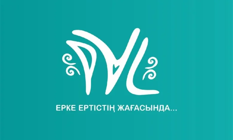
Pavlodar has unveiled a new city logo, drawing inspiration from the Irtysh River and ancient petroglyphs. Unlike the city's official coat of arms, this logo is designed to be recognizable and versatile, appearing on banners, mugs, T-shirts, and social media.

The city administration’s press service explained that the new logo aims to boost tourist appeal, create a cohesive style for official and city events, and be used in public spaces and on souvenirs and online platforms.
The logo’s design combines historical and cultural elements. The symbol is formed from the abbreviation “PVL” in a minimalistic font inspired by Turkic writing, the “Olentinskaya Pisanitsa” petroglyphs, the Kazakh national ornament “Koshkar Muyiz,” and the paleontological monument “Goose Flight.” A heart-shaped element adds originality and symbolizes love for the city. To unite citizens across generations and positively represent the city, the descriptor “Erke Ertistin zhatasynda…” was chosen, with a simple font completing the logo, as detailed on the city administration’s Instagram page.
The color scheme features blue, wormwood, orange-sand, and turquoise, chosen to evoke the sky, the flag of Kazakhstan, the Irtysh steppe, and the Irtysh River.
“The corporate identity aims to convey Pavlodar’s rich historical journey, cultural diversity, openness, and hospitality, under the theme ‘Tarikh-Zhangyru-Orleu’ (History-Renaissance-Promotion),” the city administration stated.


